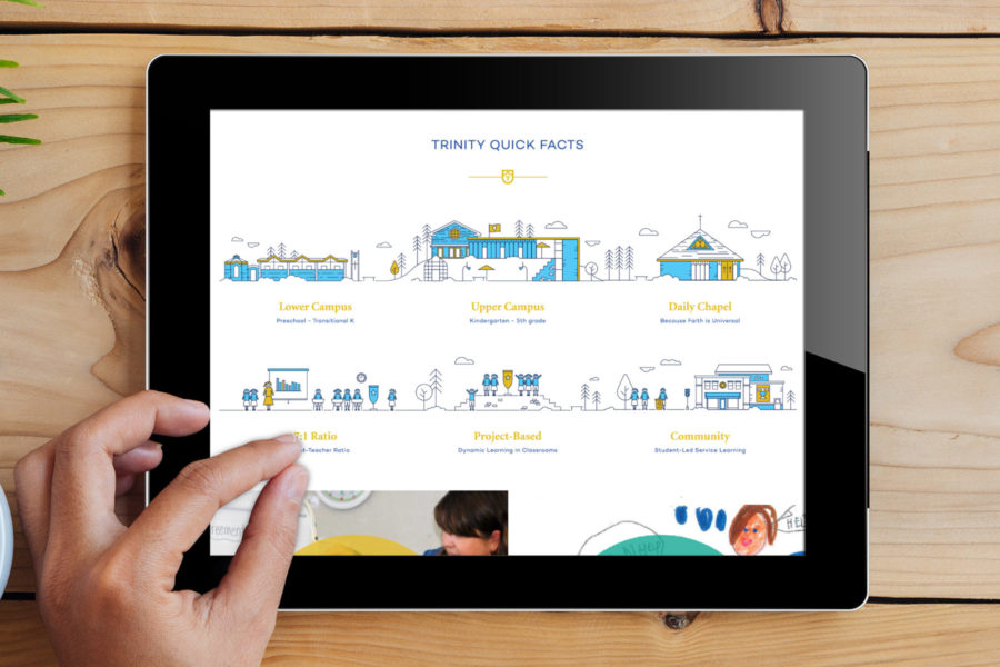
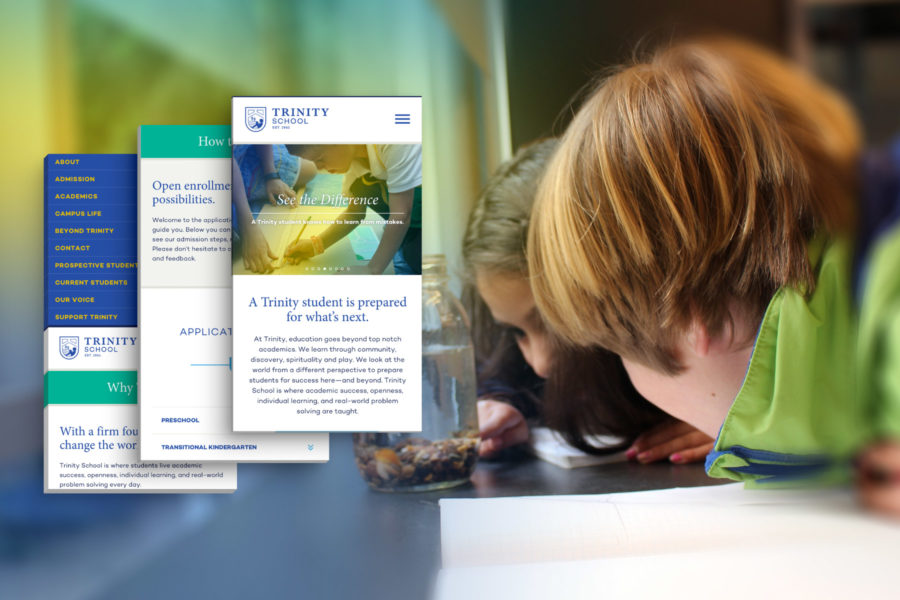
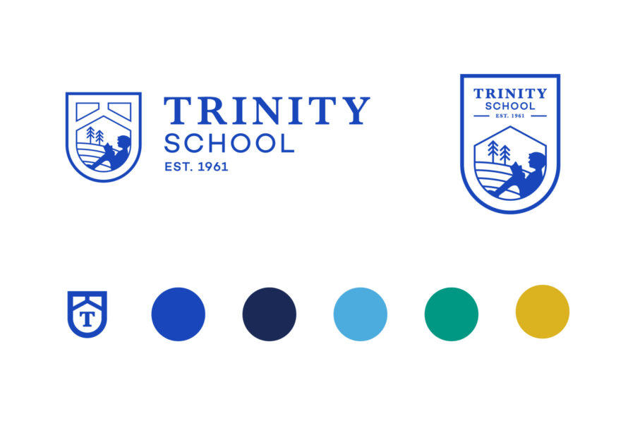
Situated in the heart of Silicon Valley, no school develops students more poised for the future. However, Trinity School recognized it was time to venture forward with their appearance, web presence, and messaging. Personify tapped into the core of a Trinity education to create a fresh look grounded in roots of values and traditions, while evolving to meet a diverse and forward-looking world.
Trinity School
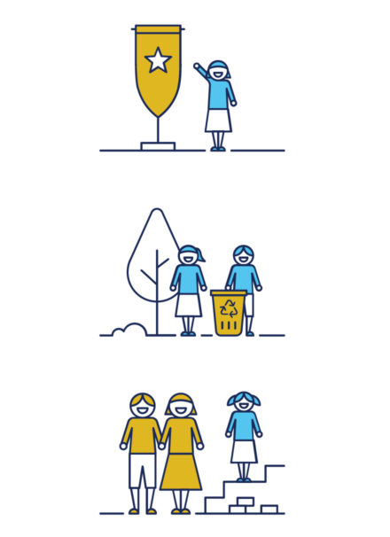
Brand Strategy, Illustration, Messaging, Print Collateral, Visual Identity, Web Design + Development

A Trinity student is prepared for what’s next.
EVOLVING TRADITIONS
After in-depth discovery, Personify developed a logo and supporting identity edgy enough to compete with the top start ups, but classic enough to maintain their Episcopal traditions. The incomparable qualities Trinity students showcase also fueled the overarching campaign, “See the Difference.” This idea connected the stand out traits of successful Trinity students with concrete examples of abstract educational standards all school claim to fame. A Trinity student is ready for the future, and it’s time to see the difference.
